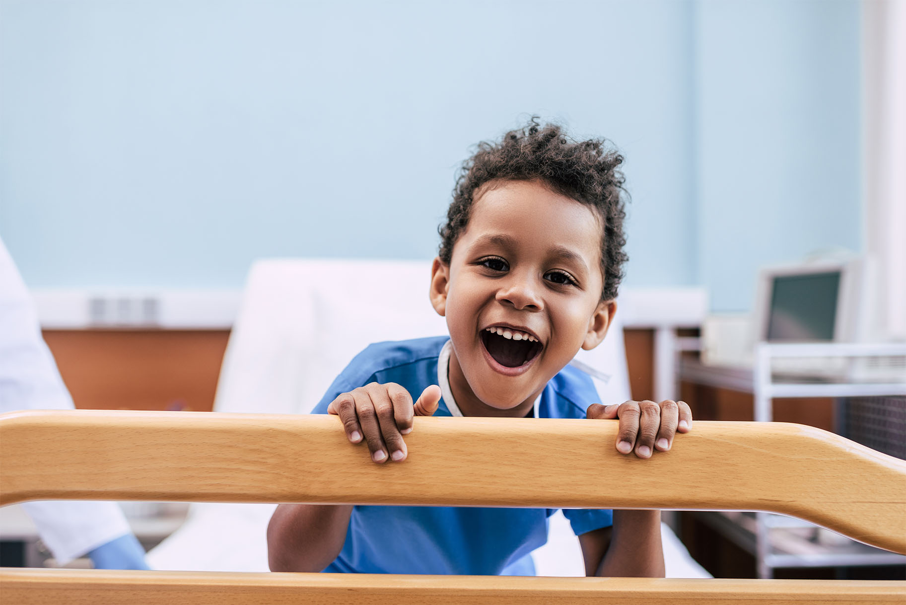

Child Play is a charitable organization that donates toys and games to children's hospitals and domestic violence shelters worldwide. I choose to do a website redesign for Child's Play Charity because of the potential impact small changes to their website could have on the children this organization supports. This was completed as part of a class project. I worked together with a team of three. I further iterated on all aspects of this project to make it my own.
User Interviews
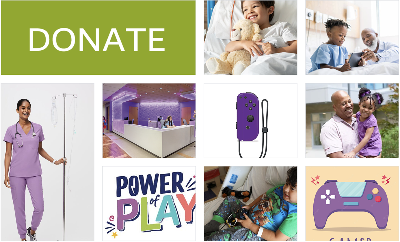
Moodboard
Low Fidelity Desktop Wireframes
High Fidelity Desktop Wireframes
Clickable Prototypes
User Tests

We kicked off the project by deep diving into understanding the potential user insight with a goal of understanding how people interact with charities and their potential pain points. We evaluated competitors to see potential opportunities for improvement. We took our findings and implemented a more clean and concise webpage. Finally presented our design to potential users and continued to iterate.
We planned and conducted a number of interviews with
potential users to get and understanding of how people interact with charitable organizations and their websites.
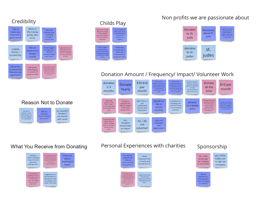
Followed that with affinity mapping to analyze results and pinpoint patterns.
We determined that 100% of people we interviewed regularly donate or considering donating to charity. They are more willing
to donate when organizations are credible and transparent about what they do.
We continued discovery by doing a competitors analysis on organizations similar to Child's Play. We analyzed websites for St. Jude, The Jared Box and Charity Gaming. We also conducted a Heuristics Evaluation.
Upon understanding how people interact with charities, some of their pain points and also trends on other organization website's we noted opportunities for improvement in the following areas:
With our redesign goals in place we moved on to ideate and created a moodboard and low fidelity wireframes in Figma.


We conducted user testing of a low-fidelity prototype. We asked users to make a donation, locate social media links and use the navigation. We then compared result from all tests pinpointed some commonalities and new ideas.
We conducted a number of A/B Test to test two design elements. We found 72% of the users we tested preferred Body Design B and 89% of users preferred Map Design B.
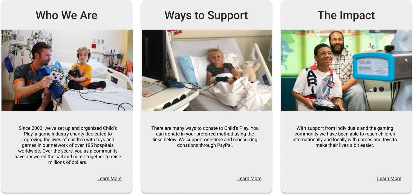
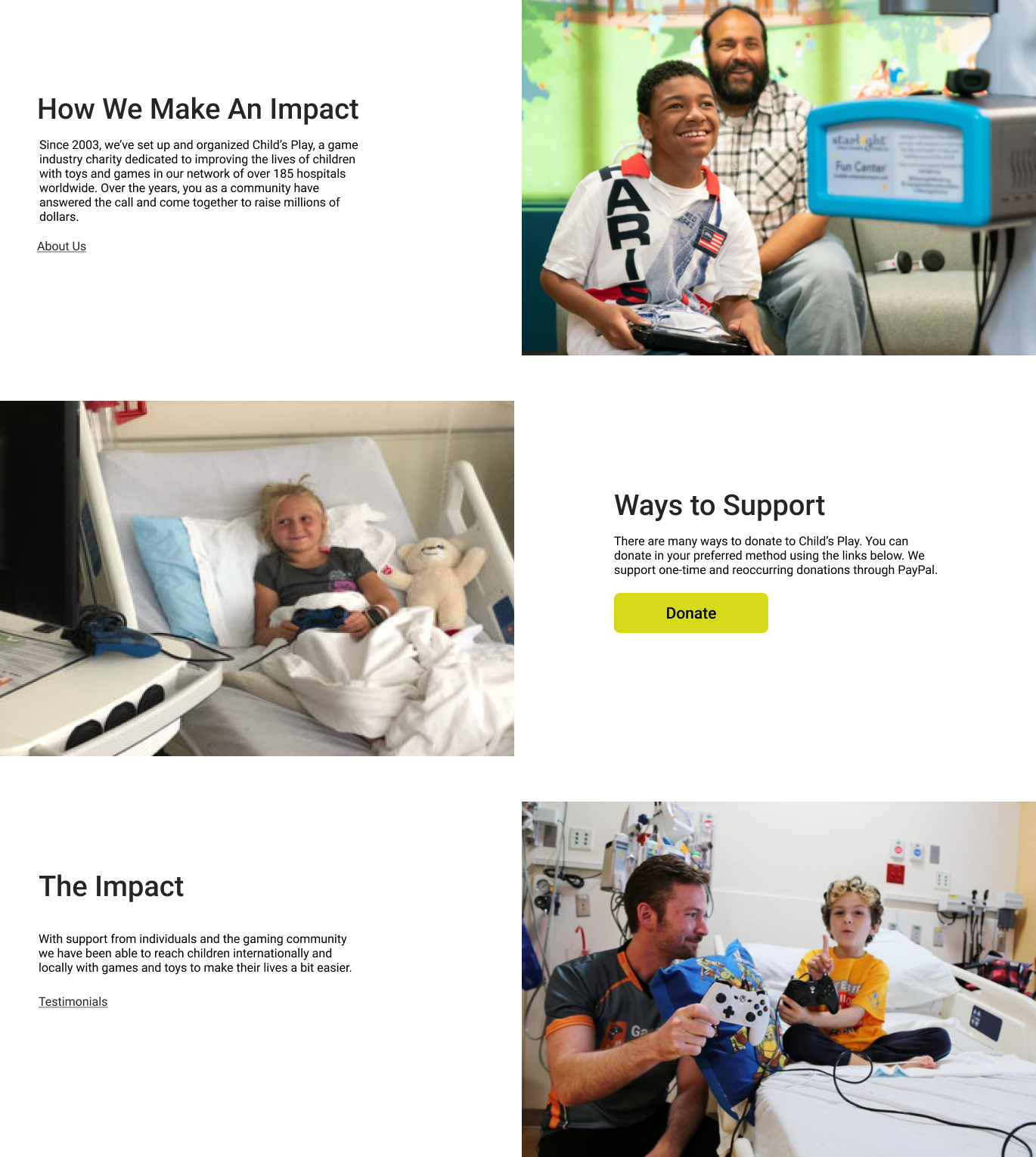
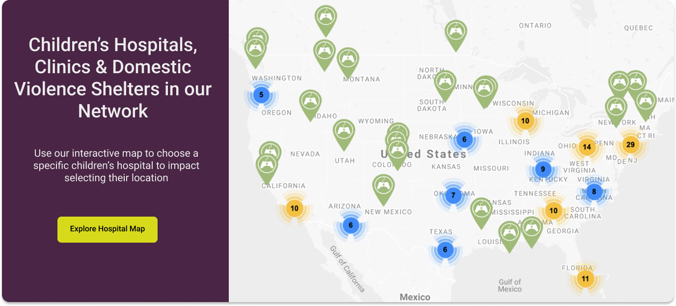
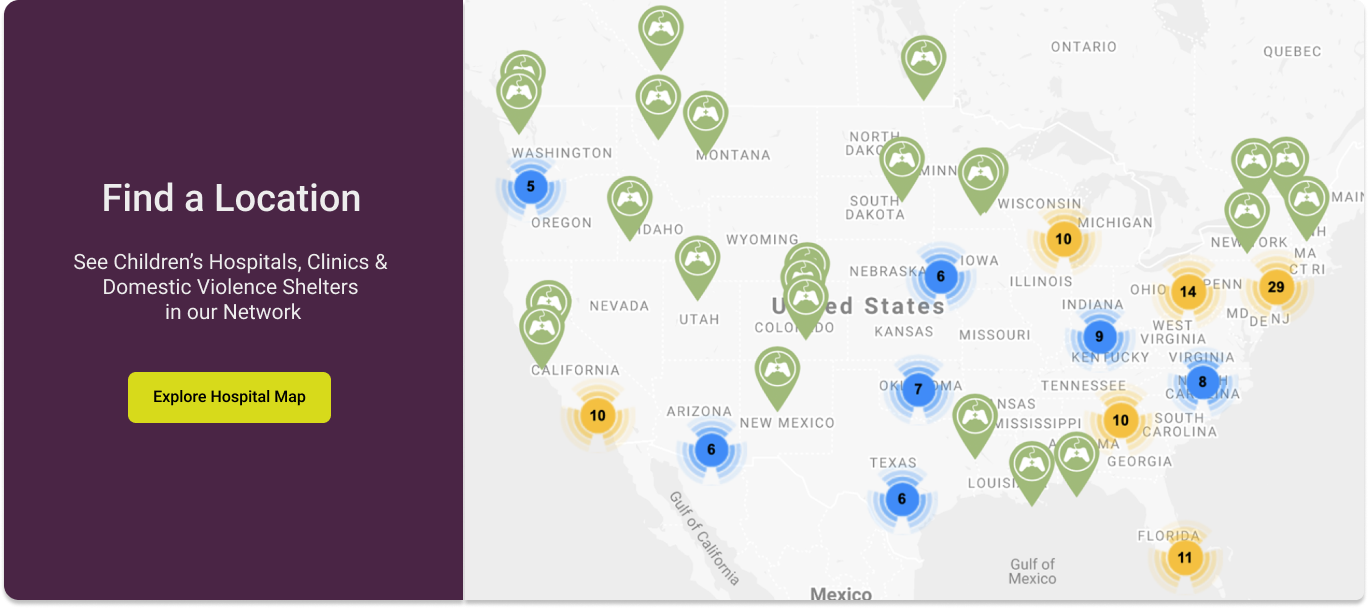
Our final wireframes contain redesigned header, body and footer of the homepage

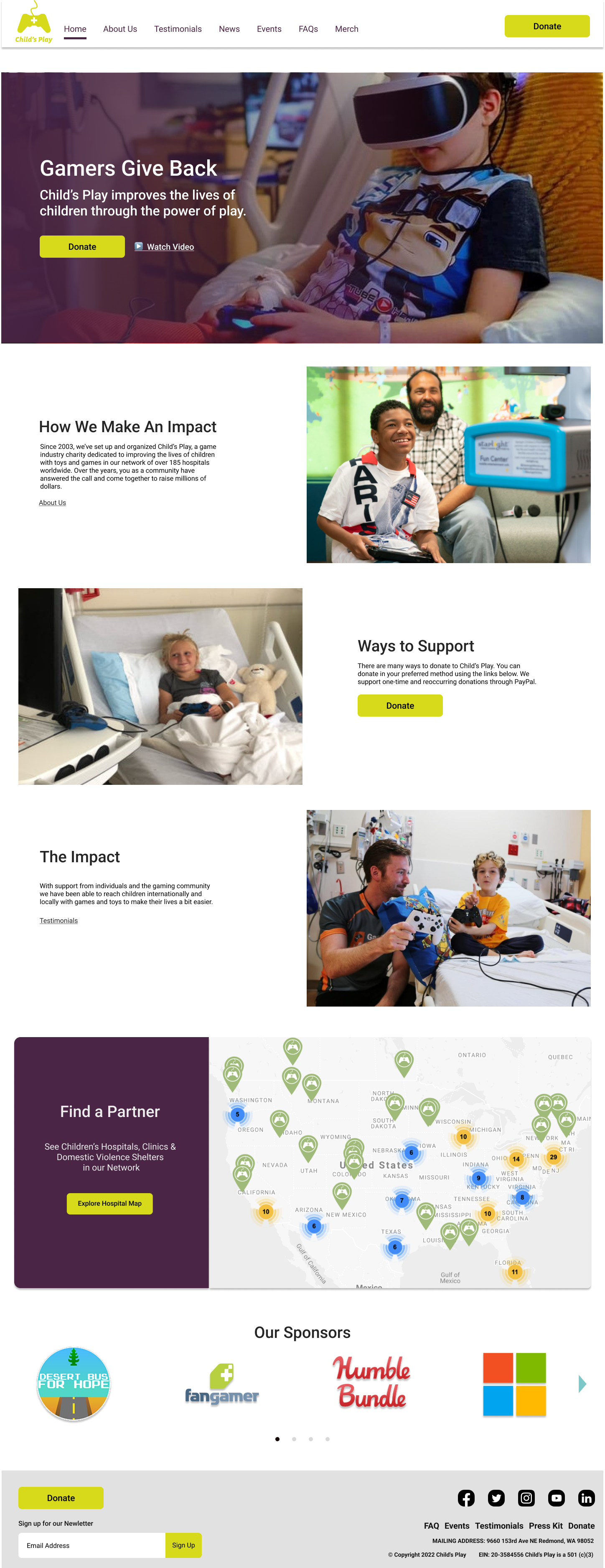
In this project I gained opportunity to create high-fidelity wireframes. I was able to work as part of a team which generated different perspectives and ultimately a better design. In the future I would like to increase the time spent on discovery by increasing the number of people who participated in interviews as well as including more stakeholders. I would also like to increase the number of people participating in A/B testing. Overall, the team was very happy with the redesign. We cleaned up the navigation and made information easier to find. We made the purpose of the organization and website more clear. A fresh color pallet that complies with accessibility guidelines will ensure that the website is more inclusive.